Mobile Device Testing in Practice
Testing the websites we create throughout development goes a long way to helping ensure a good user experience at launch. Until fairly recently this would entail checking a site in just a few desktop browsers at a handful of screen resolutions, correcting for the common rendering differences. But today the proliferation of mobile devices such as smartphones, tablets and everything between means that we’ve reached a point where testing every possible combination of device and browser is simply impractical. So as conscientious website owners and developers what should we do?
Which Devices?
We can start by trying to identify which particular devices are most important to test against for our particular site. Normally this involves a bit of common sense and a visit to the Audience section of Google Analytics. The reports here provide us with some useful information about our current website visitors.
The two data-points of most interest are called Mobile Device Info and Operating System (selectable as Primary Dimensions on the Mobile Devices report). Here we can see which mobile platforms and particular devices are used the most. And this provides a sensible starting-point when it comes to planning our testing.
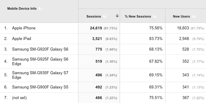
Because the mobile landscape is changing quite rapidly, we probably don’t want to go back beyond a couple of months when it comes to looking at the popularity of individual devices. However we can use historic data to identify some useful wider trends. For example the decline of Blackberry and rise of Android as a share of mobile browsing are two patterns that are pretty evident across most of our clients’ sites. And this is where the common-sense bit comes in.
We shouldn’t blindly follow the data provided by our Analytics, but remember that it will always need some interpretation in the context of wider industry trends.
Simulators vs. Hardware
One of the challenges of mobile testing is the sheer number of devices out there. As a website owner or developer you probably can’t afford to buy them all. Luckily it isn’t necessary to do all you testing with real hardware and most of the major mobile OS makers provide device simulators as part of their free development kits. These allow you to launch a virtual versions of a device on your Mac or PC.
On the Android side you can specify all manner of options for your virtual devices from the screen resolution to the amount of on-board RAM. The iOS Simulator that comes with Apple’s SDK is a bit more limiting in that you can only really test on the latest version of iOS, but it includes all the current iPhone and iPad variants.
This undoubtedly makes simulator testing a very attractive option. You can have virtually any device at your finger-tips for little or no cost. But real hardware testing still has an important role to play because to some extent clicking and pointing at a simulator on a screen can’t replace playing with a design on a real device, tapping and swiping with your finger and interacting with a page exactly as your end user will.

At The Pixel Parlour we often use hardware devices during the early stages of design development, rely on simulators during development and then switch back to hardware again at the end of a project for final testing. Although by no means comprehensive our current mobile device testing line-up covers a good cross-section of different smartphone & tablet operating systems and screen sizes:
- iPhone XR
- iPhone 7 Plus
- iPhone 6s
- iPhone 5s
- Moto G
- Google Nexus 7
- iPad Pro (10.5inch)
- iPad Air 2
- iPad Mini
- Apple Watch Series 4
- Apple Watch Series 2
Even if you don’t always have real devices to hand during development it’s important to get a feel for how they are being used day to day. Whatever time you can beg, borrow or steal (ok, maybe not steal) with some real hardware – preferably the ones most popular amongst your website’s audience – will be useful in shaping your development and inform your testing when working with these devices’ simulator equivalents. For example, having lived with both devices for a while now I find that on an iPad I do most of my browsing with the screen in landscape orientation, but on the Nexus 7 the reverse is largely true.
Letting go of pixel perfection
The idea that our sites should look pixel-for-pixel the same across every browser on every device is something we’re going to need to learn let go of in a world where new mobile devices with different capabilities (and limitations) are being released seemingly every day. Development philosophies such as Progressive Enhancement encourage us to be more forward-looking in our approach. Developers should ensure a base functionality and usability that is consistent across all devices, but then be able be to harness the latest web technologies to enhance the user experience for visitors on more capable devices, rather than dumbing down to match the capabilities of the lowest common denominator.
When it comes to testing we should be pragmatic and ask ourselves: Does this issue I’m seeing affect the core usability of the site or compromise any other key project goal?
By separating usability from purely aesthetic issues we can quickly narrow in on those which are really important rather than absorb time and budget implementing hacks to achieve 100% back-compatibility.
So something like a missing drop-shadow or rounded corner on an older version of Internet Explorer is probably an acceptable compromise between development time and user benefit, but a totally broken menu which makes part of the site inaccessible to a sub-set of users – not so much.
Go forth and start testing!
The real take-away message from this post is that whatever mobile device testing you can do will be better than none. Even if your testing is fairly limited you’re likely to discover lots of ways to improve the user experience of your site for mobile users, many of which will probably improve the experience for your desktop visitors too. Target your site’s most popular devices, approach testing pragmatically and you’ll find any time spent will be likely to deliver positive results.
Written by
Chris Barron
In his role as Technical Director Chris oversees all development work ensuring our creative ideas are translated into fast, reliable and elegant technical solutions.
Follow Chris
Receive Updates by Email
Sign up for our latest knowledge base articles delivered direct to your inbox.
Easy unsubscribe at any time. Learn more about how we handle your personal data in our Privacy Policy.
Knowledge Base
More from the Development topic


