How to Optimise Images for Performance
Images are often the biggest contributor to the total ‘weight’ of a web page and thus its load time. So as design trends have moved towards an ever more image-rich presentation it has become increasingly important for a website’s image assets to be appropriately formatted and optimised.
There’s a lot that can be done on the server side and the setup of your content management system to help out. Applying GZIP compression, serving scaled images and caching can all be configured when a website is first created. But as content publishers adding to our sites on a regular basis they is still an onus to upload appropriately sized and formatted images as we go.
There aren’t any specific rules about how big image file sizes should be. But if you are looking for a general rule of thumb the below provides some guidance to help see if you’re along the right lines.
Page-filling backgrounds or large gallery images – under 150KB
Smaller in-page images that support content – under 60KB
Images used for icons, logos and generally smaller graphic elements – under 20KB
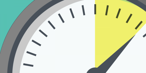
So what simple steps can we take for some quick performance wins?
Size your image appropriately
Sizing your image to the same pixel dimensions that it will be displayed in the site is a great first step to avoid unnecessarily large file sizes. Although a good content management system may handle some of this automatically for you, sizing before you upload gives you greater control over exactly how the image will appear and is a sensible first step before applying other types of optimisation.
Pick the right image format
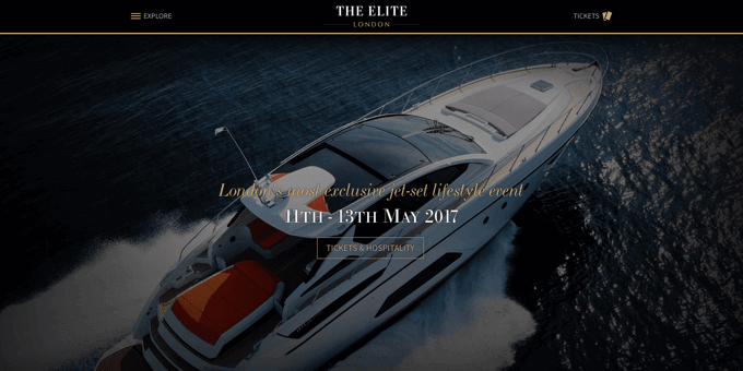
Choosing the right format for your image can go a long way not just to saving on size but also giving the best display quality. JPEG, PNG and GIF are the most common web image formats, each with their own strengths. If animation is needed then GIF is your only choice. If your image has transparency, contains text or detailed graphic elements then PNG is the way to go. For anything which is a more traditional photo (like the background image in the website shown below), JPEG is usually the best choice.
With continued improvement in support for CSS3 properties and the Scalable Vector Graphic (SVG) format in modern browsers it is also important to ask the question of whether they might be a better choice than an image in many cases. For things like icons and user interface elements like buttons SVG and CSS are light-weight, resolution-independent options for serving crisp shape-based graphics. However to support older browsers in most cases you’ll still need to provide an image-based fallback, so read on…
Use Save for web
Most image editing software offers a Save for web option at the point of export and using this is a great start in getting your images slimmed down for use online. Often there will be some additional controls that go along with this. In the case of JPEG images there is usually a quality slider with settings from 0 to 100%. Adjusting this even a couple of percent can yield significant file size savings. But it’s not a case of one size fits all so it’s worth experimenting to find the lowest acceptable quality setting for each image.
Apply lossy image optimizing
After saving out from your image editor of choice there are some great dedicated tools out there for providing additional image compression. Most of these use a lossy approach in that some of the original resolution is sacrificed in the name of size savings. A bit like the compression used in the MP3 audio format attempts to save on the bits of the sound it doesn’t think we’ll notice, tools like TinyJPEG attempt to apply a similar smart compression for images. While the keen-eyed might be able to tell in a side by side comparison of certain types of image, in most cases optimised versions will be indistinguishable from their originals.
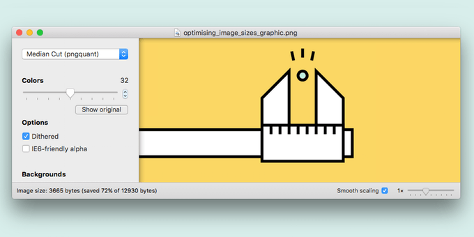
For PNG files ImageAlpha and TinyPNG are two good options. Both get the majority of their size savings from reducing the number of colours in an image’s palette. TinyPNG is a zero-settings simply drag-n-drop solution that typically saves between 50% and 70% on the size of a standard PNG image. ImageAlpha gives a bit more control with a slider to set the number of colours and some additional compression flavour options to help find the best balance between file size and quality.
Apply lossless image optimizing
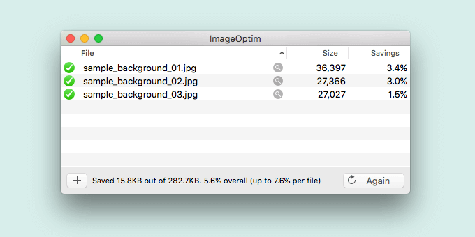
In contrast to lossy optimising lossless optimising, as the name suggests, doesn’t sacrifice any quality. Savings are made by stripping unnecessary meta-data and colour profiles, whilst leaving the image data intact. The size reductions are smaller but following on from a lossy compression tool it can be a handy extra couple of percent saved. Our go-to for this is ImageOptim, where optimising a bunch of images is as simple as selecting them and dropping them into the app’s window for them to be replaced with optimised versions.
Cumulative savings
When this kind of simple optimisation before uploading is combined with server-side technologies such as GZIP compression and caching the cumulative impact can be significant, delivering much faster page loads, particularly for mobile visitors. If we take the example of the images used in this article, in their original un-optimised form they weighed in at 755.65kb. But in less than a minute I had that down by 70%. This kind of saving across an entire website could make a real difference to page load time, particularly for visitors on slower connections.
Written by
Chris Barron
In his role as Technical Director Chris oversees all development work ensuring our creative ideas are translated into fast, reliable and elegant technical solutions.
Follow Chris
Receive Updates by Email
Sign up for our latest knowledge base articles delivered direct to your inbox.
Easy unsubscribe at any time. Learn more about how we handle your personal data in our Privacy Policy.
Knowledge Base
More from the Development topic
